Welcome Screen
The Welcome Screen is the first thing shoppers see when they open your quiz — before any questions appear. It's where you introduce the quiz, collect optional contact details, and optionally display a brand image. Click Welcome Screen in the left panel to open it in the editor.
Content & Copy
Heading — the main title displayed prominently on the welcome screen. Keep it short and inviting, e.g. "Find your perfect match" or "Take the Hair Discovery Quiz".
Subheading — a short paragraph below the heading describing what the quiz does or what the shopper can expect. Optional but recommended.
Button text — the label on the CTA button that starts the quiz. Defaults to "Get started".
Footer note — small text shown below the CTA button. Optional. Good for reassurance copy like "Takes 2 minutes" or "No account needed".
Style Settings
The Style Settings card controls the visual appearance of the welcome screen text and button, independently from the rest of the quiz.
Heading
- Font family, font weight, font style (normal / italic)
- Font size — separate desktop and mobile values (e.g.
40pxdesktop,28pxmobile) - Color
- Text transform
Subheading
- Font family, font weight, font style
- Font size — desktop and mobile
- Color
- Text transform
Footer note
- Font size — desktop and mobile
- Color
CTA Button
- Background color and text color
- Font family, font weight, font size (desktop + mobile), text transform
- Border radius — e.g.
0pxfor square,8pxfor rounded - Width — Auto (fits the button text) or Full width (stretches across the welcome form)
- Padding X / Padding Y — horizontal and vertical spacing inside the button
- Alignment — Left or Center (only shown when width is set to Auto)
Form Fields
The welcome screen can optionally collect the shopper's name and email before they start the quiz.
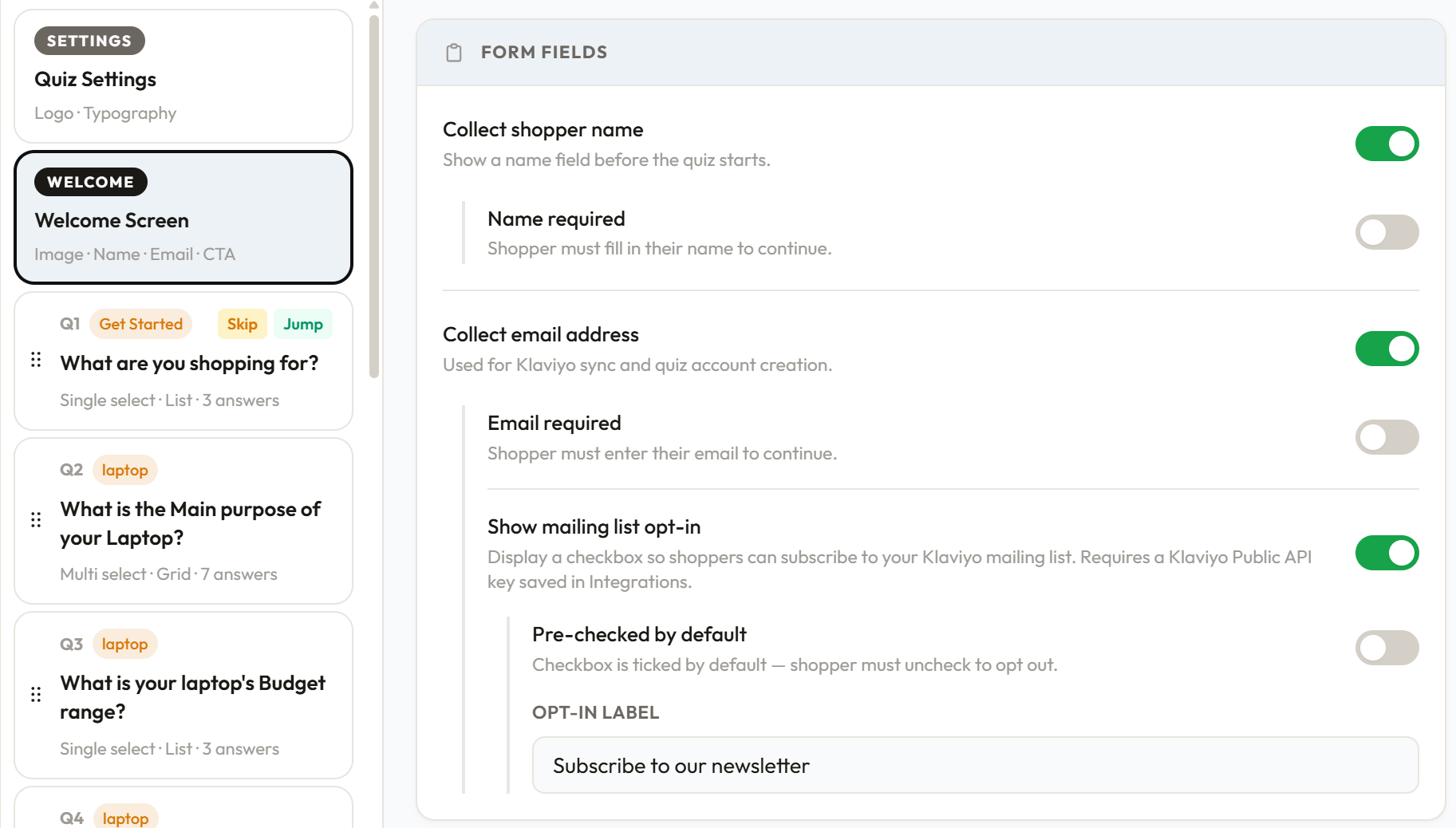
Collect shopper name — shows a name input field on the welcome screen.
- Name required — if enabled, the shopper must fill in their name before they can continue.
Collect email address — shows an email input field. The collected email is used for Klaviyo sync and shopper account creation.
- Email required — if enabled, the shopper must enter their email before they can continue.
- Show mailing list opt-in — displays a checkbox so shoppers can subscribe to your Klaviyo mailing list. Requires a Klaviyo Public API key saved in Integrations. Available on the Starter plan and above.
- Pre-checked by default — the checkbox is ticked automatically; the shopper must uncheck it to opt out.
- Opt-in label — the text next to the checkbox, e.g. "Subscribe to our newsletter".
Welcome Image
You can optionally display a brand image alongside the welcome form.
Show a welcome image — toggle to enable the image. When disabled, the welcome form takes the full width of the quiz widget.
Image position — three layout options:
- Left — image on the left, form on the right
- Right — form on the left, image on the right
- Background — image fills the entire welcome screen behind the form content
Image width — for Left and Right positions, a slider (25%–65%) controls what proportion of the welcome screen the image occupies.
Overlay colour and opacity — for Background position only. An overlay is placed between the image and the form content so the text remains readable. You control the overlay colour and its opacity (0%–100%).
Hide image on mobile — recommended. Hides the image on small screens so the form takes full width, which is almost always better on mobile.
Image — provide an image URL, or upload a JPG, PNG, WebP, or GIF directly. Uploading requires a paid plan. On the free plan, you can still use an external image URL. You can replace or remove the image at any time.
Alt text — accessibility description of the image for screen readers.
Content Layout
Controls the width and positioning of the welcome form content area.
Desktop
- Content width — shown when the image is set to Background or disabled. Controls what percentage of the widget the form content occupies (40%–100%).
- Content max width — the maximum pixel width the content area can reach, regardless of the widget's size (280px–900px).
Mobile
- Content max width — the maximum pixel width of the content area on mobile screens (280px–1000px).
Saving
Click Save changes in the sticky bar at the bottom. Changes are not saved automatically.
Was this page helpful?