Quiz Settings
Quiz Settings controls the quiz-wide branding and typography applied across the entire widget — welcome screen, questions, and results. Open it by clicking Quiz Settings at the top of the question list in the left panel.
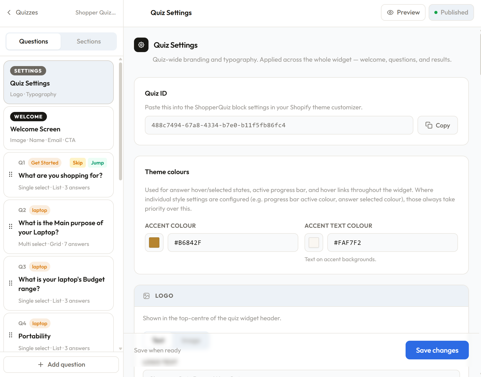
Quiz ID
At the top of Quiz Settings you'll find your Quiz ID — a unique identifier for this quiz. This is what you paste into the ShopperQuiz block in your Shopify theme customizer, or into the [shopperquiz id="..."] shortcode on WooCommerce. Click Copy to copy it to your clipboard. You can also find it in the URL while you're in the Quiz Builder.
Theme colours
Two global colour tokens used throughout the widget:
Accent colour — used for answer hover and selected states, the active segment of the progress bar, and interactive links throughout the widget. Where individual settings override this (for example, a custom selected background colour on answer options), those always take priority over the accent colour.
Accent text colour — the text colour shown on top of accent-coloured backgrounds, such as a selected answer.
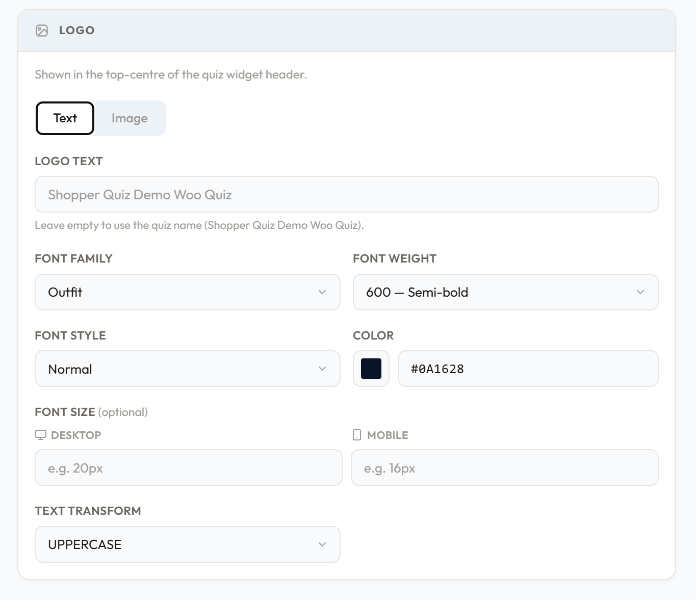
Logo
The logo appears in the top centre of the quiz widget header. You can display it as text or as an image.
Text logo
- Logo text — the text to display. Leave it empty to use the quiz name automatically.
- Font family — choose from the available font options
- Font weight — thin through black
- Font style — normal or italic
- Color — hex colour for the logo text
- Font size — separate values for desktop and mobile (e.g.
20pxdesktop,16pxmobile) - Text transform — none, uppercase, lowercase, or capitalize
Image logo
- Upload a JPG, PNG, WebP, or SVG file
- Alt text — accessibility description of the logo image
- Max height — slider from 16px to 64px controlling how tall the logo image renders
Image uploads require a paid plan. On the free plan, only the text logo option is available.
Base typography
The foundation for all text in the widget. Every other typography section inherits from this unless explicitly overridden.
- Font family
- Font weight
- Font size — desktop and mobile values
- Color
- Text transform
Question typography
Overrides applied specifically to the question heading text. Inherits from base typography by default. You can override any combination of: font family, font weight, font size (desktop + mobile), color, and text transform.
Question subtitle typography
Overrides for the optional subtitle shown below the question heading. Same controls as Question typography.
Answer options
Controls both the typography and box styling of every answer option in the quiz.
Typography — font family, font weight, font size (desktop + mobile), color, text transform. Inherits from base typography by default.
Box styling
- Border radius — controls the shape of answer boxes (e.g.
0pxfor square,8pxfor rounded,999pxfor pill) - Padding X / Padding Y — horizontal and vertical spacing inside each answer box
Default state — how an unselected answer looks:
- Background color
- Border color
- Border width
Selected state — how an answer looks when the shopper clicks it:
- Background color
- Text color
- Border color
- Border width (the selected border color also controls the checkmark color in checkmarks and icons display styles)
Answer alignment — aligns the label text within the answer box: left, center, or right. Primarily affects image-style answers where the label sits below the image.
Answer description — style for small description text shown below an answer label: font family, font weight, font size (desktop + mobile), color, text transform.
Icons style — applied when the answer display style is set to Icons:
- Icon size (e.g.
56px) - Icon border radius (e.g.
50%for circle,8pxfor rounded square)
Section labels
Typography for the small label that appears below the progress bar indicating which section of the quiz the shopper is in. Controls font family, font weight, font size, color, and text transform.
Progress bar
Controls the progress bar that runs across the top of the quiz widget.
Segments
- Active — the color of the current segment (the one in progress)
- Completed — the color of segments already passed
- Inactive — the color of upcoming segments not yet reached
- Height — slider from 1px to 8px
Section label typography — typography for the section name shown above the progress bar, with separate desktop and mobile font sizes.
Continue button
The continue button appears on multiple-select questions. Single-select questions advance automatically without showing it.
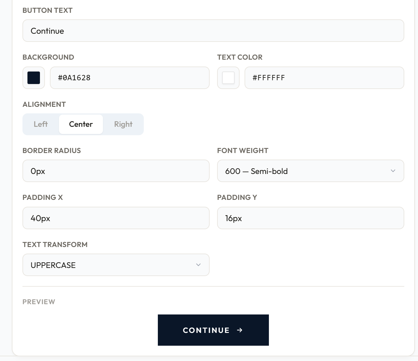
- Button text — default is "Continue"
- Background color
- Text color
- Alignment — left, center, or right
- Border radius — e.g.
0pxfor square,8pxfor rounded - Font weight
- Padding X / Padding Y — horizontal and vertical padding inside the button
- Text transform
A live preview of the button renders below the settings so you can see changes immediately.
Saving
Click Save changes in the sticky bar at the bottom of the page. Changes are not saved automatically.
Was this page helpful?